Asian Youth Outreach
Branding
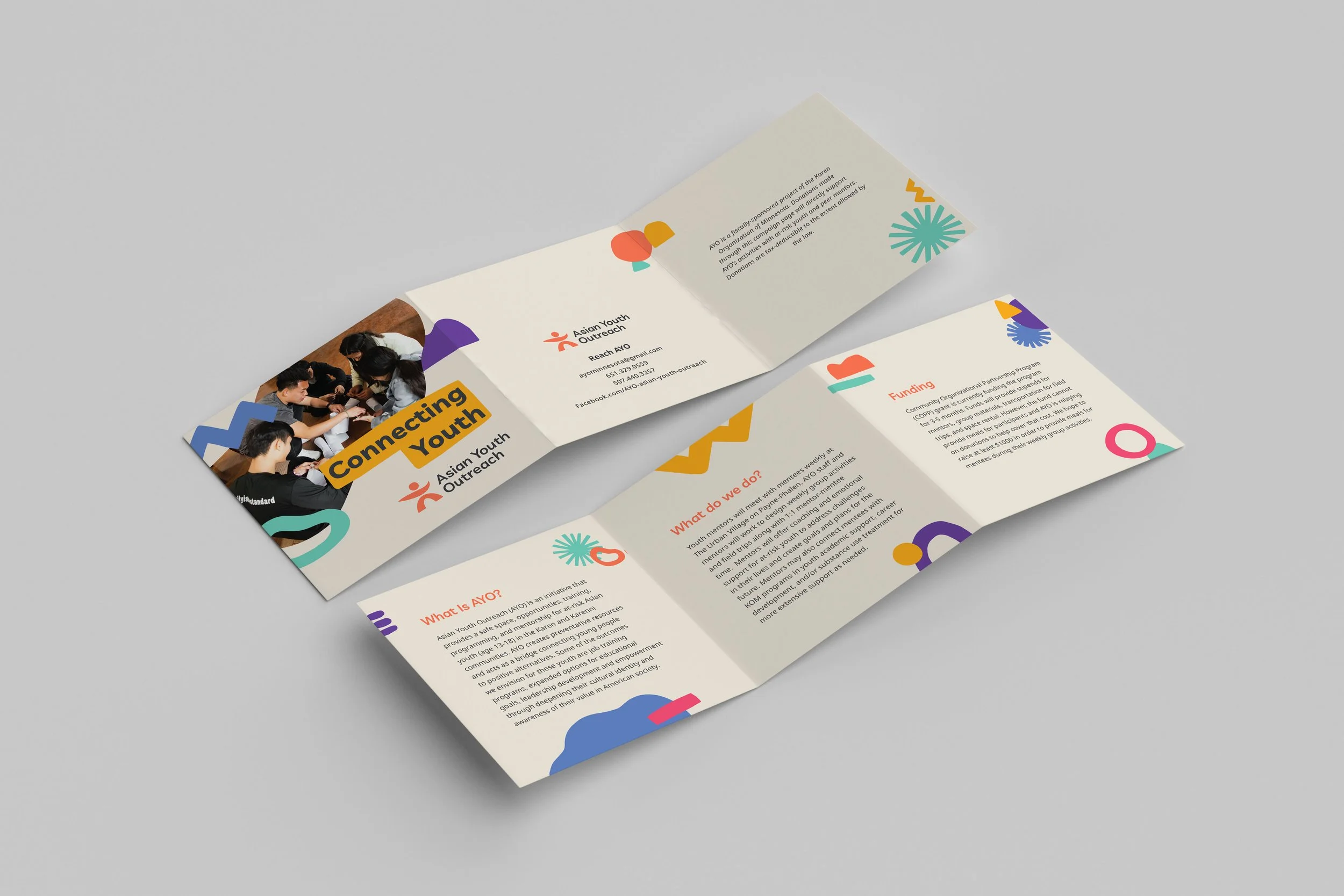
CHALLENGE: Asian Youth Outreach (AYO) is an initiative that provides a safe space, opportunities, training, programming, and mentorship for at-risk Asian youth (age 13-18) in the Karen and Karenni communities as well as acting as a bridge to connecting young people to a positive alternative. They wish to refresh and redesign to be more simple and improve their brand recognition to be able to grow their organization.
APPROACH: In the refreshed logo symbol is shown as a person reaching representing AYO as an organization and the arch on the logo suggests a bridge for connecting young people. The color for the logo symbolized youthfulness as well as making it feels comforting, evoking a sense of warmth, and joy.